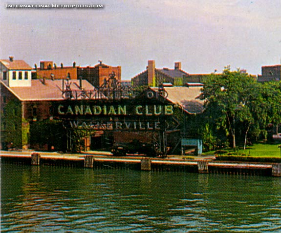
Here’s an interesting view I recently picked up. It’s a colour view of the Hiram Walker Distillery from the water, before the redevelopment of site that took place in the late 1950’s. I think many of the “new” buildings were erected around 1967-58. As you can see one of the “new” warehouses are visible, behind the offices, similar to the one that was converted into the Club Lofts. I’m going to take a guess and date this around 1954-55 or so…

I like this view, of the old sign. The sign was erected in 1900, designed by Albert Kahn. At the time it was the largest electrical sign in the world. I also think it’s a neat glimpse at the old Victorian era Hiram Walker’s which was in its final years, in only a few short years from when this photo was taken, many buildings were replaced and modernized. A snapshot of what was, right on the brink of total renewal.
——————————————————————————————————-


I had thought that the warehouse buildings were built in the late 1930s?
What a wonderful ‘distillery district’ could have evolved among those old ivy covered brick structures had not ‘progress’ intervened.
Another thought: I wonder about the prospect of recreating that signage (faithful in every detail) perhaps bridging the roadway at the foot of Devonshire Rd. At Riverside Dr. The ‘gateway’ to Old Walkerville long anticipated. Perhaps the distillery would contribute.
Diageo doesn’t spend squat and I doubt Hiram Walker’s (the small storefront) has any money to do so. Though it wouldn’t hurt to ask.
Diageo does not own Hiram Walker, Pernod Ricard does. And no, they probably wouldn’t be willing to spend the money seeing as they no longer own Canadian Club. The Canadian Club Brand Centre would be the right people to ask, but whether they have money to do so is another question. I know first hand that they make a killing on wedding rentals, but I imagine it costs plenty to maintain the grounds and building.
man is that ever beautiful. i love those old wearhouses. i’ve recently found a bunch of photos from the turn of the century and those wearhouses were all over the place. brick roads, tree lined streets…….*sigh*
Imagine that ornate iron work reconstructed (wonder if A. Kahn has original drwgs?) with identical signage lettering and illumination to mimic antique electric lighting. Only modification somewhat taller pylons for vehicular clearance below sign body. Placement just enough south of Devonshire/Riverside intersection to clear rail siding R.O.W. Original signage wording perfect for gateway announcement: ‘Walkerville’ and ‘Canadian Club’ are historically intertwined and pretty much synonymous. Would be a great marketing symbol for the whiskey brand too…seems like some corporate level would be willing to at least partially fund. Maybe the WHC has a few dollars left in their kitty, eh Andrew?
Pregnant on my own idea?
no, no…..i think it’s great idea!
This is the first time that I’ve seen that original sign in any photos.. that is very cool, thanks for sharing Andrew