A final look back at the now closed Greyhound station.

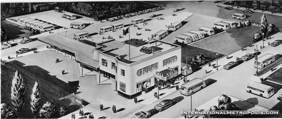
An architectural rendering of the station. From the Bernie Drouillard collection.

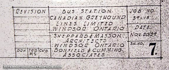
The station was designed in 1939, by Greyhound architects Bonfield & Cummings along with longtime Windsor Architects Sheppard & Masson. It was a common practice that when out of town architects did work in a city that they would take a local firm on as “associate architects”. This is the first time I have seen the main architects listed as “associates”. Perhaps as a US firm they weren’t eligible to practice in Ontario?

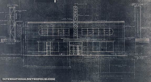
A view of the elevation plans of the station. Note in the lower right hand side, how close the tunnel ventilation shaft runs to the ground. The proximity of the tunnel to the existing structure will make the redevelopment of the site very difficult. I can sense a surface lot….

A view of the station and the bus sheds from above.

Now vacant, the station looks bare and decrepit. Years of dirt have accumulated behind the sign leaving the outline still plainly visible from University Ave.


A few shots of the bus loading area.


Anything they put there in it’s place will probably look better than that eyesore.
i think it would be nice to just clean and refursbish the bus sheds and pave the lot and have a nice outdoor market with a wide variety of vendors. probably would save money too in comparison to demolishing…..ah….to dream….
wow…i bet it was gorgeous in its day! i wonder what’s underneath all that ugly siding. the drawing of the place looks really art deco-ish
Pina, yes it was!!
Andrew, I just noticed the architectural drawing does not feature the “Greyhound” tower sign on the canopy. I trust one of the actual photos of the station ‘in the day’ ca. 1940 is forthcoming in future entries in this series. 🙂
I can’t help but wonder if the crap on the outside was peeled off, if the building could be brought back to near original appearance.
Pina, it was a limestone covering or somethign to that effect. Very nice, but of course the hideous ’70s get a hold of it….
Yeah, I noticed that too… I’m not sure what that was all about. However it is noted on the blueprints, that the sign is to be supplied by Greyhound. Maybe the sign wasn’t included in the rendering as it wasn’t their design?
I think the likeliest reason is that it would have obscured the building’s design. Note that none of the surrounding buidings are included in the rendering either, but the shadows are… It’s almost more of a site plan drawing….
I’ve always thought that removing the exterior cladding, and doing a little restoration work could make this building real gem. Ann Arbor kept their station (same architects Bonfield & Cumings) and has turned it into Visitor information. A little foresight and our sation could find some reuse.
Why not demolish the bus sheds in the rear, restore the facade and build a new museum to the rear using the front part as a gateway?
There is just a real lack of vision in this city. Proof of that lies across the street in the still vacant Armouries. Any city with half a brain would have that open and in use as a comunity facility.
Here’s a vintage photo of the station Pina:
http://internationalmetropolis.com/?p=258
What a great idea AC. Move the market out of the Armouries to it’s own dedicate site at the old bus station, with open-air stalls to the north under the overhangs. Do a facepeel of the building and show for once that Windsor cherishes it’s heritage.
OK. I almost made it through that last line without peeing myself laughing!
But Andrew – the new Burger King across the street should add some class to the neighbourhood, shouldn’t it:)
Thanks for thinking the idea was great. I have plenty more where that came from! 🙂
The market is no longer in the Armouries, but hidden underneath the parking garage on Park/Pellissier. Someone can correct me if I am wrong on this. Using the old bus terminal as an outdoor market which sells other items in addition to local fruits and veggies could also help pay for itself by renting the space for minimal costs, just to cover expenses to run the facility. Clothing, souvenirs, artwork, artists on site to draw caricatures, etc. It could easily create a vibrancy in that particular area of D.T., especially if the Armouries is ever used for anything.
Just to hear some ideas, and this question is for everyone, what are some ideas you would like to see the Armouries used for?
They should turn both the bus terminal and the armouries into a combined farmer’s market. Eastern Market in downtown Detroit is 5 blocks wide by 10 blocks long. They have 5 big sheds there filled with food dealers, etc., with each shed being bigger than St. Lawrence Market in Toronto. But, what am I thinking, this is Windsor. The city doesn’t care about keeping historical buildings in service or promoting downtown with any other anchors than the bar crowd.
You people have to stop. You all have some kind of vision and Windsor doesn’t like that!
Don’t you think it would be easier to demolish it and let the land stay vacant for 20 years than to actually do something? Ego’s and agendas need to be pumped up before anyone can add their two cents.
Chris Holt brought up the BK site (formerly the great Top Hat Restaurant). We wouldn’t have to worry about it going across from the Armouries if Eddie didn’t want to have a large tunnel plaza for HIS corporation. Can anyone tell me again why we are building this when vehicular traffic is at an all-time low?
It’s called foresight ME, something that has been lacking for years in this region–building for tomorrow you know, instead of building for yesterday? The 401 wasn’t built to connect to the border because traffic in the 1960s didn’t warrant it–where did that get us? And exactly what corporation of Francis’ will benefit the plaza expansion? Last I knew his family sold Royal Pita, if that’s what you mean.
JT. He is head of the Tunnel Corporation . Eddies grand vision (or illusions. Possibly delusions) for the tunnel is to buy the Detroit half for $75 million with OUR tax dollars. I am sure we will hear something about his wisdom since he is now in control of the airport as well.
Eddie acts like these are HIS corporations and buys and wheels and deals with OUR money. He could care less whether his business ventures succeed or not.
Are there any exsisting “unmodernized” examples of what I would call streamliner modern artecture in the Windsor/Detroit area? There was a design school around that time that thought that buildings should have smooth sides with curved and/or round windows and/or stainless cladding like around the base of the Greyhound tower. A shoe store in downtown Ypsilanti I worked in during the late ’60’s had that type of cladding under the display windows that looked like it could have been stripped off something built by Canadian Car and Foundry for the CPR’s Canadian.
http://internationalmetropolis.com/?p=445
Thank you, John. Anybody got any others in the metro area?
Wow, some people here had some foresight! This building IS beautiful, and could be a lot more beautiful if the 70s siding was ripped off and the building restored.